CLIENT: Chef Soraya

Macro meal in minutes.

Logo design & art direction | Package design | Pattern design | Illustration

AllPackaging2.jpg


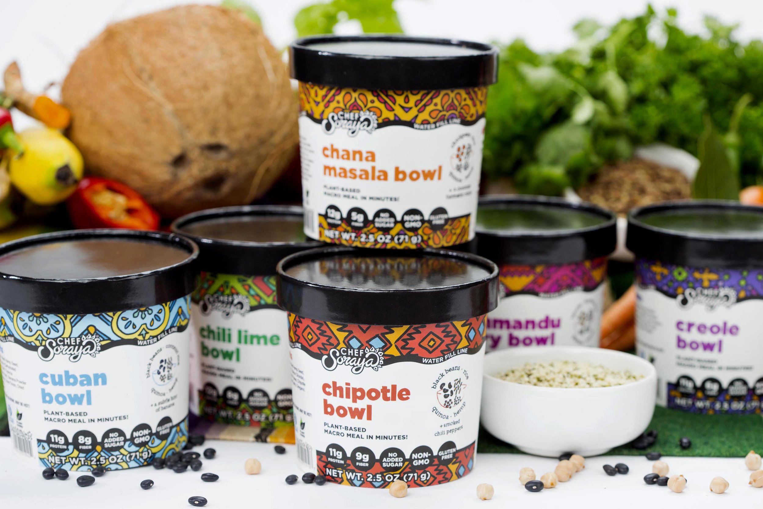
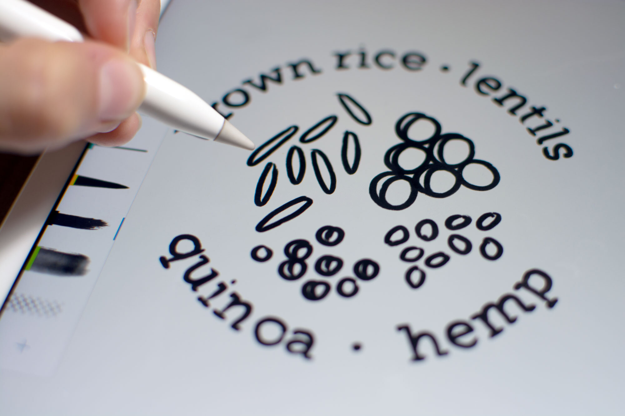
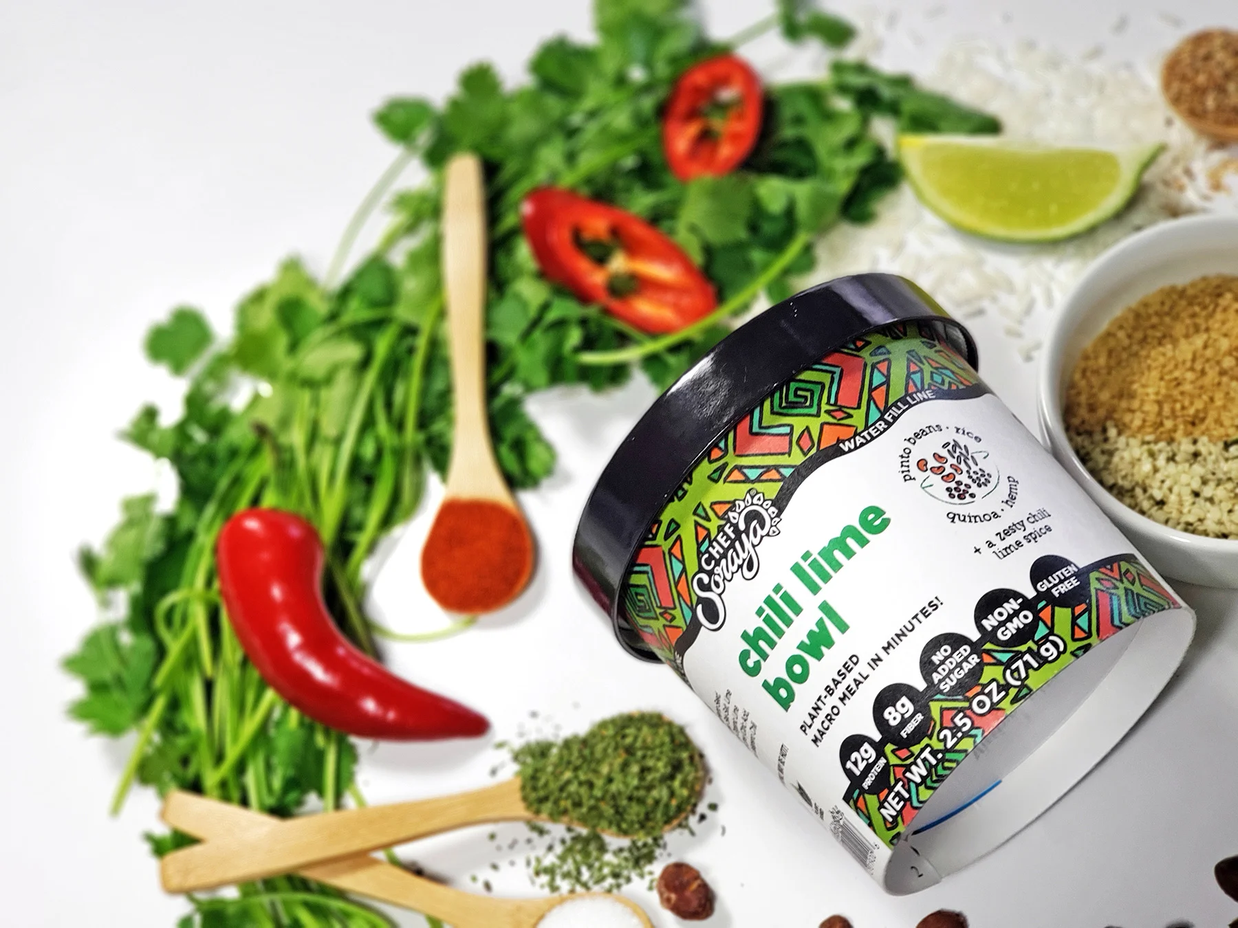
Chef Soraya wanted to refresh their brand in order to create a more streamlined design and to highlight their nutrient rich ingredients sourced from around the world. They wanted their messaging to be clear and concise, highlighting that they are a 100% plant based meal while making the product instructions easy to understand. To create this eye catching design, we were wildly inspired by different textiles and textures from the different parts of the world that the bowls were named after. We created a pattern unique to each bowl with colors inspired by the locations and ingredients. To highlight the nutrient rich bowls, we created hand-drawn illustrations for each flavor that listed out the main ingredients.


5.8.jpg
Logo_sketches.jpg
LogoOptions2.jpg


The company is named after the founder and head chef, Soraya, which also happens to be a type of sunflower. They wanted to keep this element within the branding so we showed some options with and without the sunflower. We led the direction for the logo and then their in house design team took over and brought it to the finish line.


ingredients_spoons.jpg
Cuban_Edited.jpg
IngredientIllustration_Process.jpg
Cuban-Illustration-Process.jpg
Cuban.jpg
Chana.jpg
ChiliLime.jpg
Kathmandu.jpg
Creole.jpg
Chipotle.jpg
Chana_Edit2.jpg
Directions.jpg
IngredientCircle.jpg
ChiliLime.jpg
 

before

after

Before_NoBG.jpg
After_NoBG.jpg