CLIENT: Klement’s
Sausage that links people together.
Package design | Typography | Font design

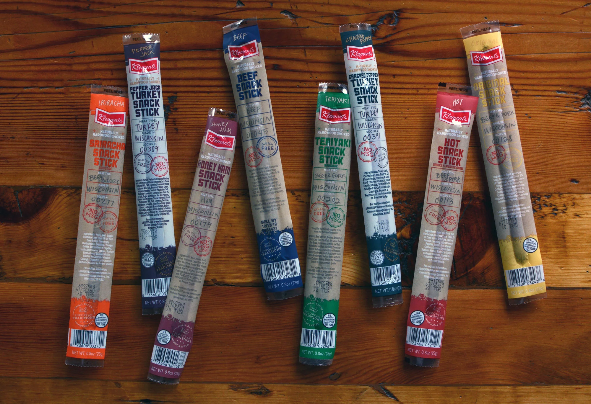
Klements came to us seeking a rebrand for their line of snack sticks. They wanted their new packaging to reflect Klement’s brand story and point of difference as a small batch, natural hardwood smoked, handcrafted, and European-tradition focused company, while appealing to both men and women. Each Snack Stick is made from recipes used for many generations that were brought over from the Old World. They are individually wrapped and packed with protein and less sugar and sodium than traditional snack items. Our challenge was to communicate through packaging that Klement’s is small batch and handcrafted, which many buyers believed their old packaging did not portray.


Since everything was completely done by hand, we created a handwritten alphabet for them to use in the future.


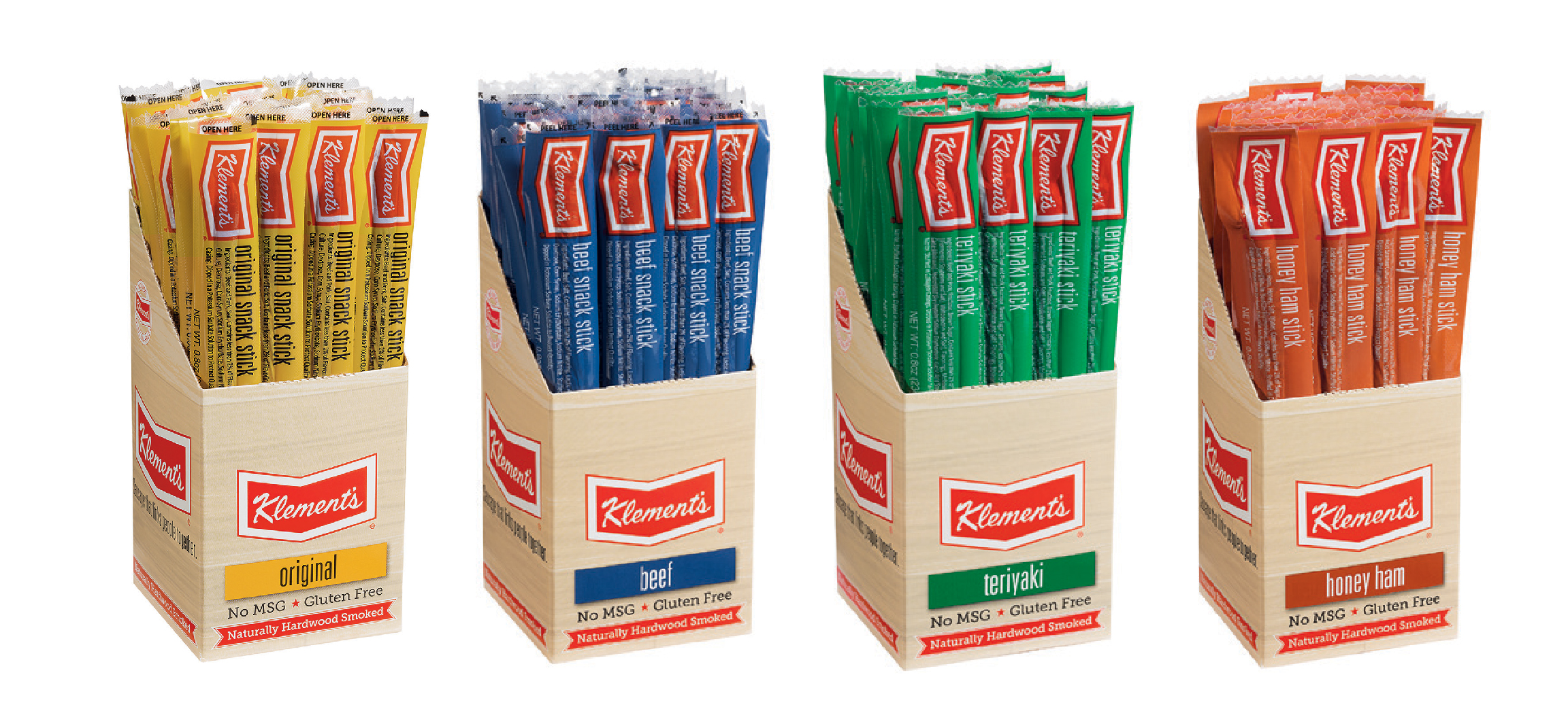
BEFORE: